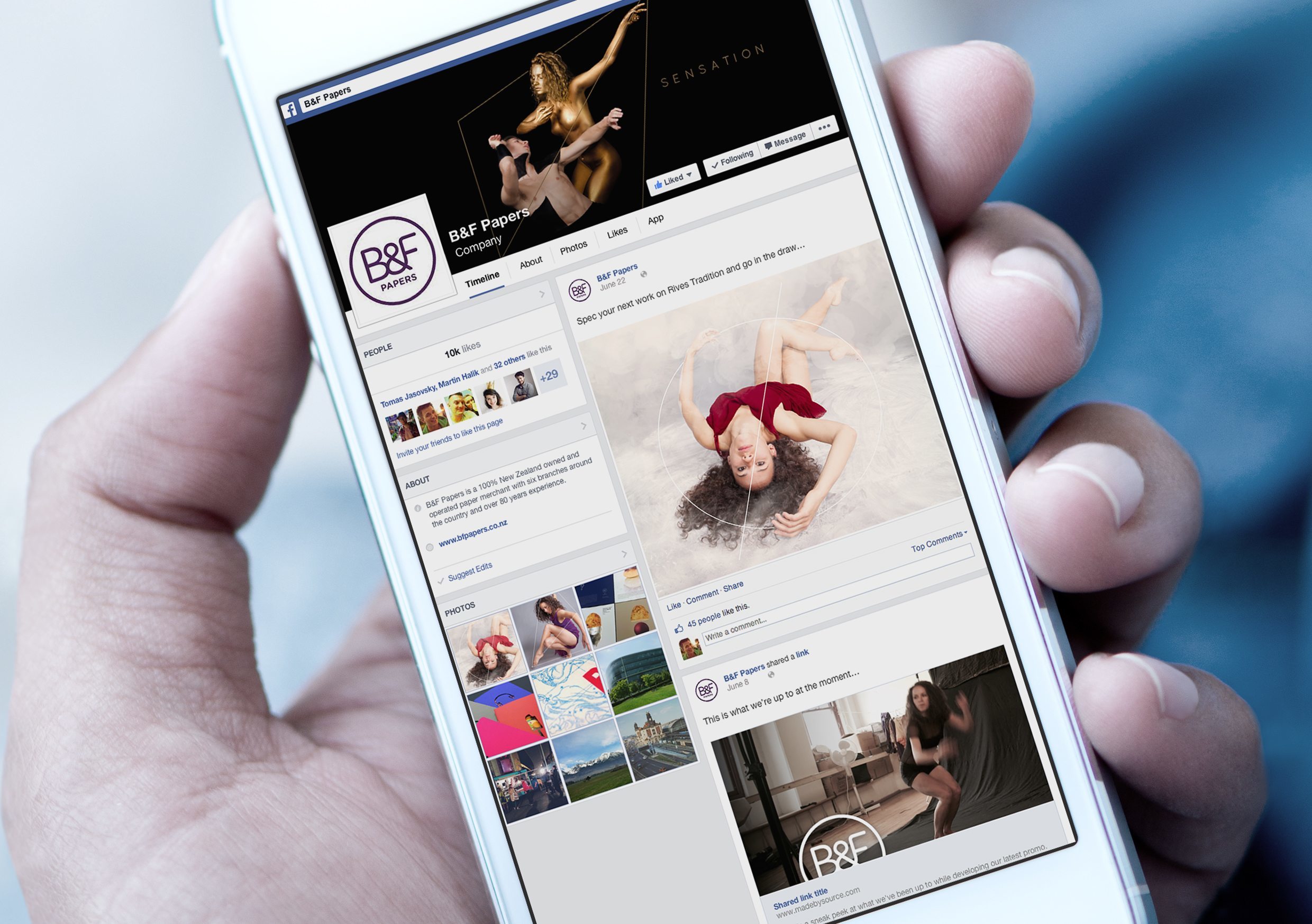
B&F Papers supply New Zealand designers with some of the most stunning papers you could ever hope to touch. But with something so tactile, how best to convey their beauty?
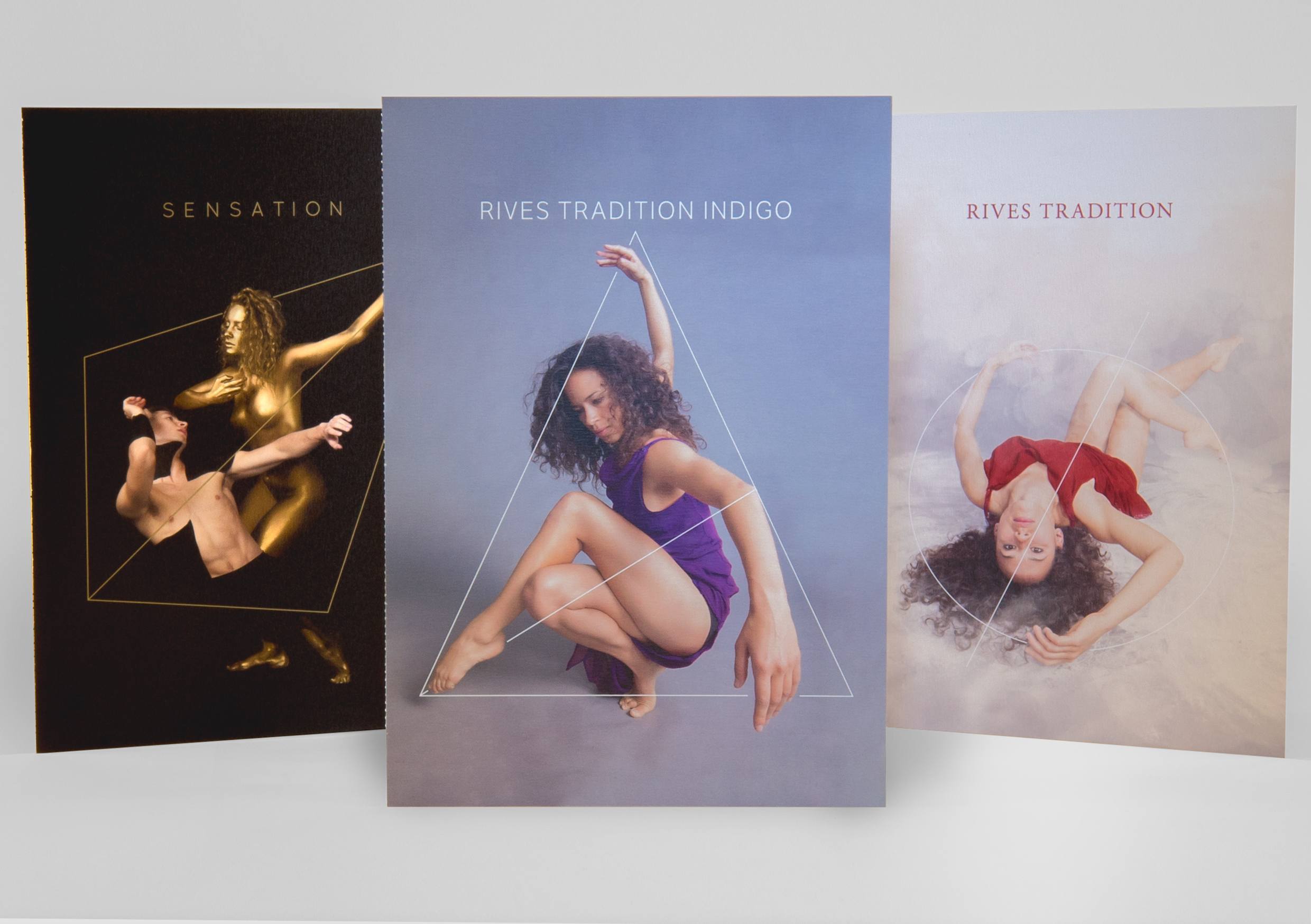
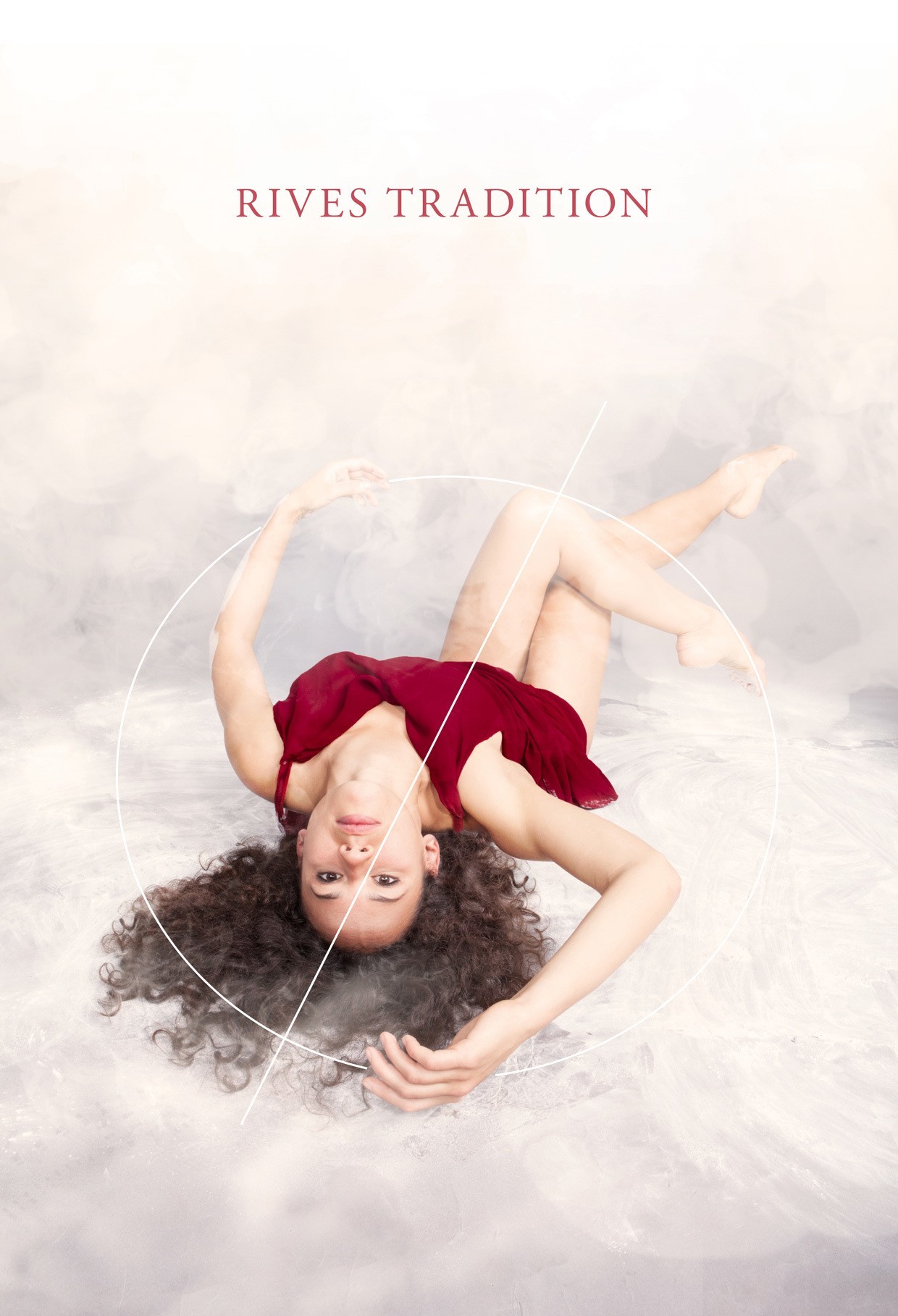
Sensation, Rives Tradition and Rives Indigo are a European paper range B&F wanted to promote. All appeared similar when unprinted but they performed radically differently once ink was applied.
When asked to help find a way to convey their distinct qualities we immediately thought of pairing them with another client. One equally diverse in nature and whose product was just as beautiful. Footnote New Zealand Dance.
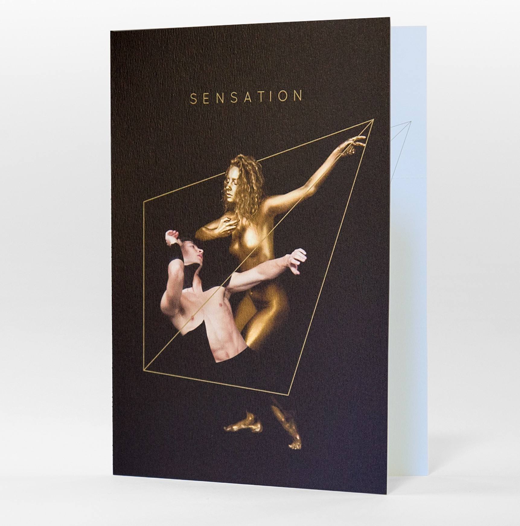
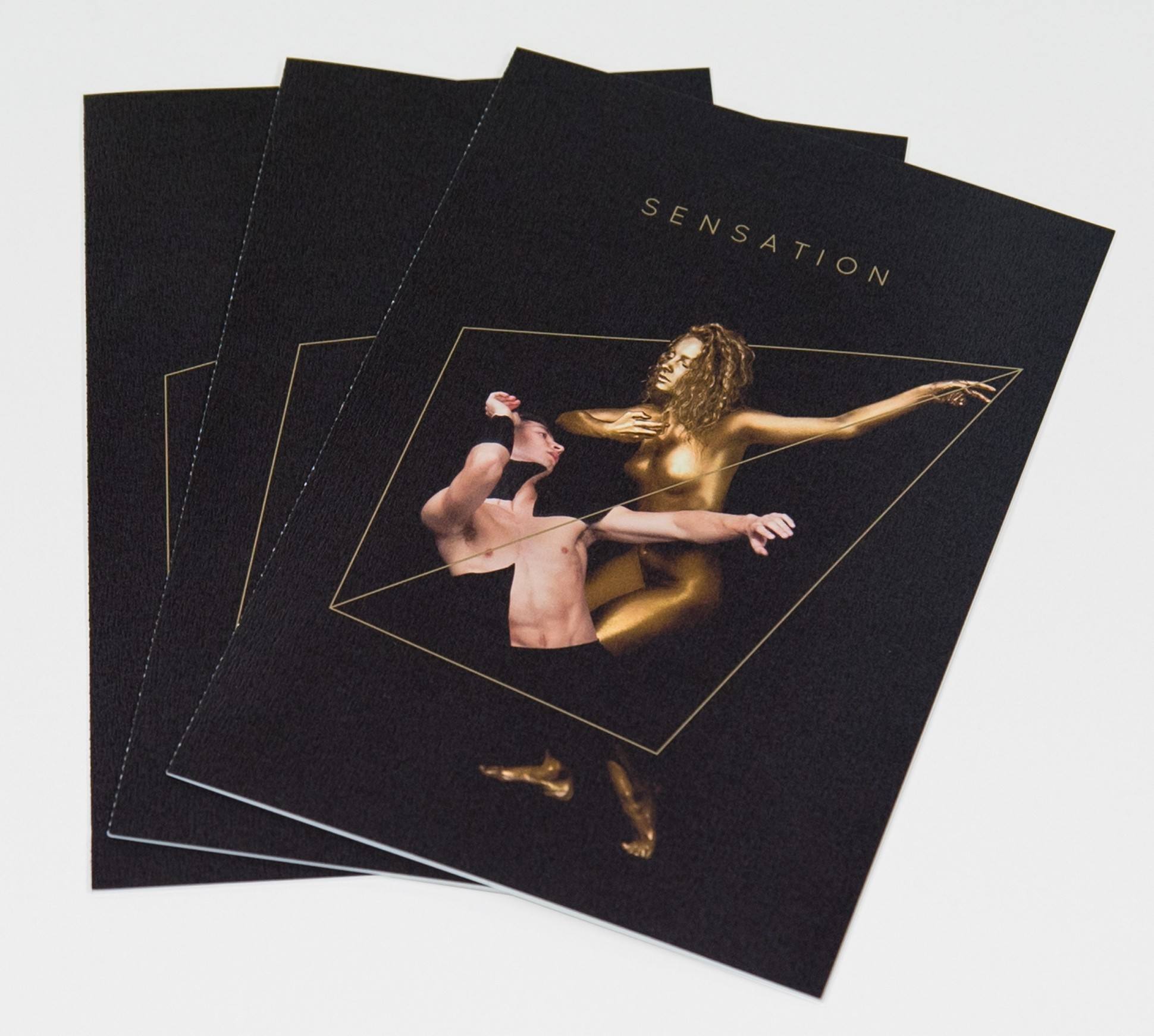
Through dance inspired forms, we managed to express each stock’s unique qualities: Gold and black painted bodies to portray hard contrasts, popping colour, shiny metallics, and angular diamond shapes for Sensation.
The female figure becoming one with her surroundings, in powdery clouds of softness and warm natural tones, with a touch of renaissance colour and round shapes for Rives Tradition.
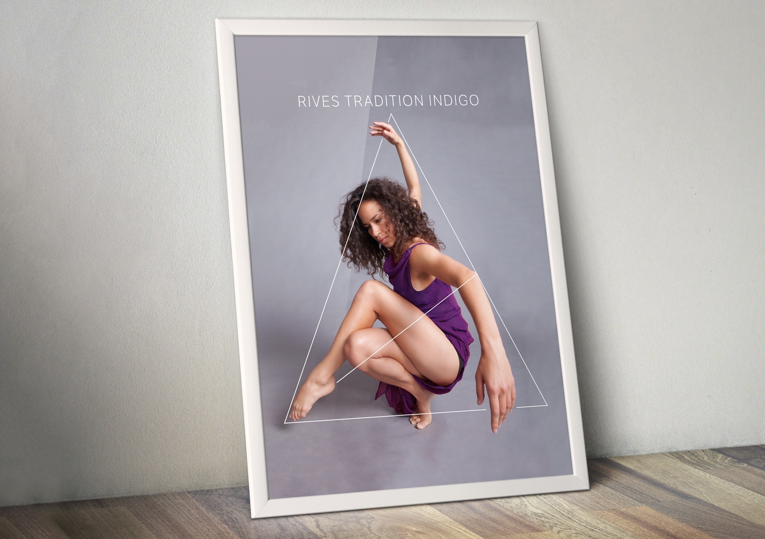
Focused, strong and simple movements, with clear vivid colour and straight lines for Rives Tradition Indigo.
Sensation, Rives Tradition, Rives Tradition Indigo
[testimonialproject icon=”heart” title=”What our client says” bgcolor=”#efefef” fullwidth=”no”]I had heard of Wonderlab through one of their suppliers, my only hesitation was my perception of their size and breadth of style.
I was extremely satisfied by the results. They came up with a fantastic range of creative solutions and concepts that completely fitted the brief, fulfilled the delivery of service in a timely and professional manner and were always willing to go the extra mile.
We received a campaign that was absolutely fit for purpose, and 100% positive feedback from our customers. Everybody enjoyed the process of working with Wonderlab. Sales and awareness of the product lines we promoted are continuing to grow which is exactly the outcome required.
We are now working with Wonderlab again on a further campaign due to this success.
–Kim Honiss, B&F Papers[/testimonialproject]